Background and Borders
Panel Description
Like all panels arranged on the right side of the interface, "Background and borders" contains a set of tools for customizing the selected element.
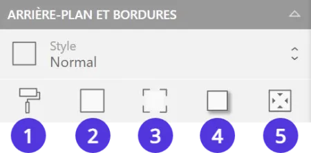
- Apply a background color
- Add an outline on the border(s) of your choice
- Round the corner(s) of your choice
- Generate a drop shadow
- Set internal margins
Background
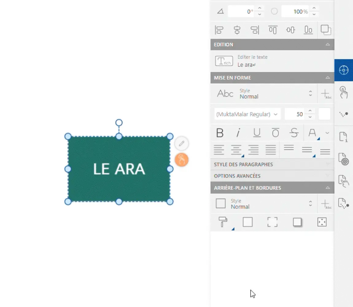
Modify your element's background by selecting the "Background" icon (1). Click on the color dot to choose a new shade, then adjust the opacity with the slider.
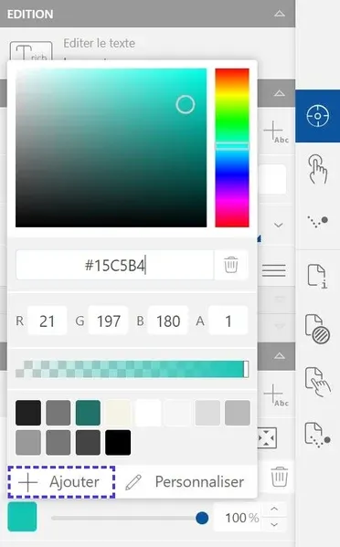
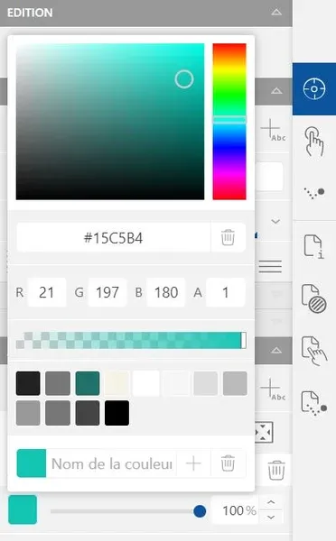
Click the "Add" button in the colors window, below the palette. Enter the name of your new color and validate.
Masks
An element's shape can be modified using a mask.
In the "Background" subsection, click on the "Add a mask" option and select the shape you want to give to your element.
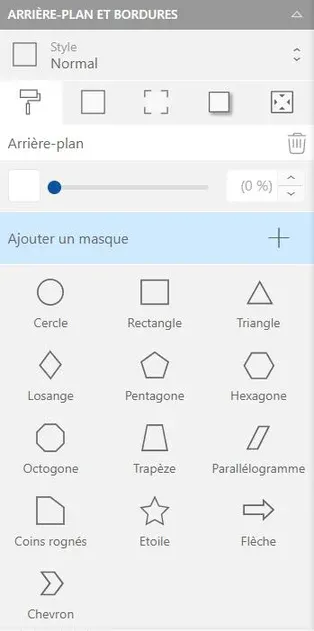
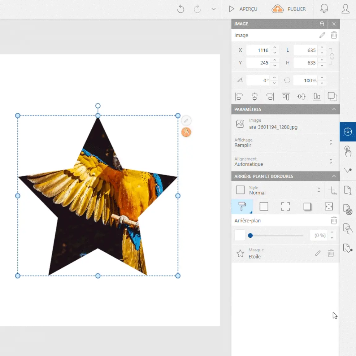
Customize the mask settings in the same subsection.
To change shape, delete the current mask by clicking the "Delete mask" button (trash icon) then create a new one in the same way.
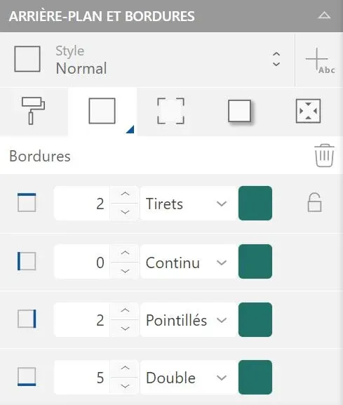
Borders
To add an outline to your element, click the "Borders" button (2). Choose a line thickness and color; you can also apply a line type like dots, dashes...
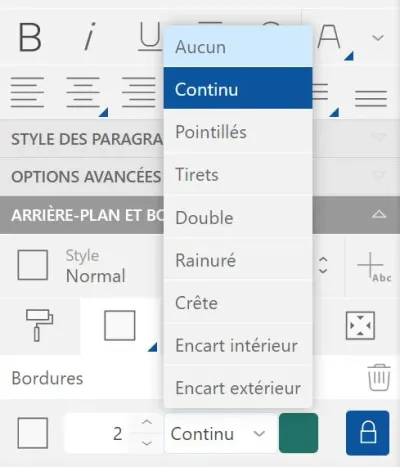
Treat your borders case-by-case by unlocking them. Click the "Unlock" icon (padlock) to display borders independently. Modify them according to your needs.

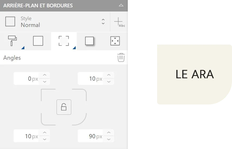
Rounded Corners
To modify the rounded corners of your element, click the "Rounded corners" button (3). Choose the desired rounding intensity.
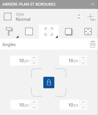
Treat your element's corners case-by-case by unlocking them. Click the "Unlock" icon (padlock) to modify angles independently.
Drop Shadow
To add a drop shadow to your element, select the "Shadow" button (4). Click the "Add" icon then adjust the shadow settings to your liking.
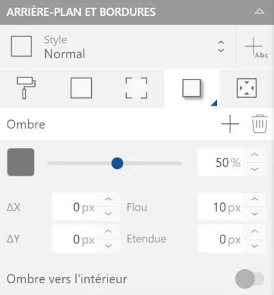
- The color/opacity bar works the same way as for background color
- ΔX and ΔY define the shadow offset on the X and Y axes
- Blur modifies the shadow diffusion; spread affects its intensity
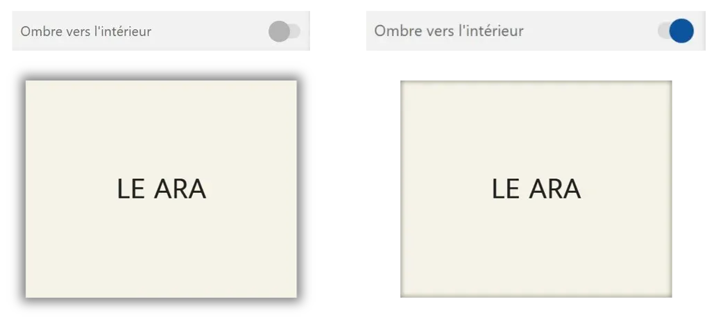
- The shadow is, by default, outside the element; it can be applied inside using the "Inner shadow" function.
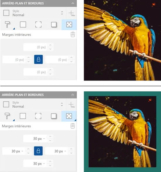
Internal Margins
To apply internal margins to your element, click the "Internal margins" button (5). Choose the size of your margins in pixels.
Click the "Unlock" icon (padlock) to modify margins independently.
You can reproduce your customization using styles. Click the "Add a style" button next to the "Style" dropdown button to save the formatting: apply this style to other elements to modify them with one click.
For more details, take a look at the Text customization article, "Styles" section.