Tutorial: Create an Interactive Image
Step 1: Choose an Image
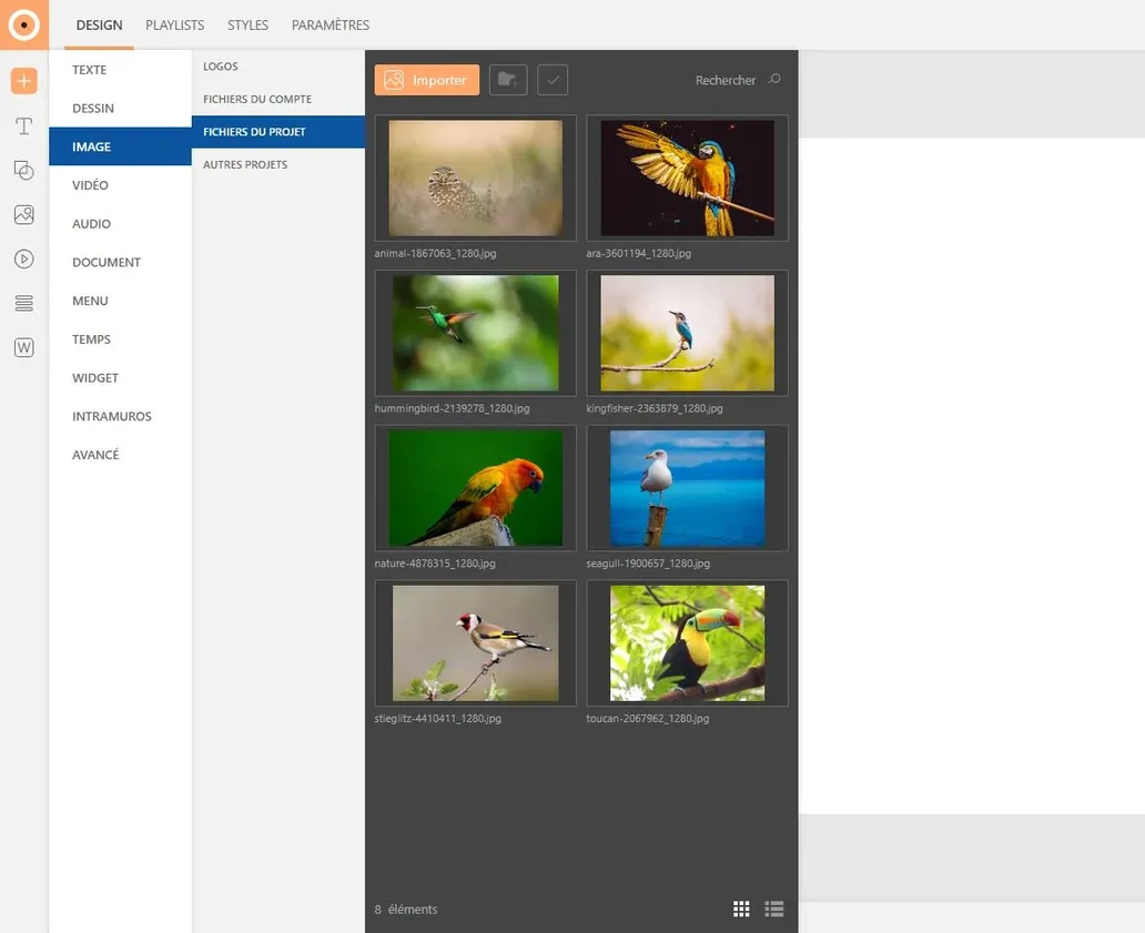
Unfold the "Gallery" tab (image icon) from the left sidebar then select the image of your choice. To insert it, click on the "+" button or drag it directly into the page.
Beforehand, don't forget to import your images into the gallery.
Customize the size and alignment of your image in the "Options" window (crosshair icon), on the right of the work area.
Step 2: Create Buttons
Text Button
Click on the "Text" button in the insertion menu. Choose the text style you want to apply or draw the button directly on the page.
Customize the button's appearance in the "Element customization" tabs (crosshair icon) on the right of the work area. Modify the text and block style to your liking: modify angles, add a background color, apply a shadow...
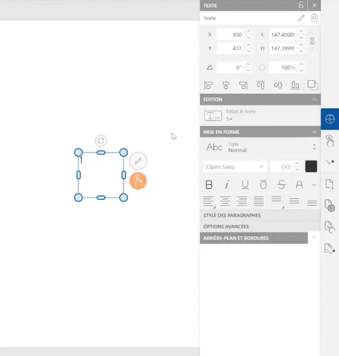
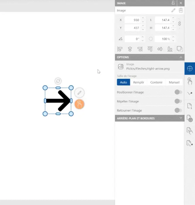
Image Button
Click on the "Image" button in the insertion menu. Choose the image you want to add then click on the "+" button or drag the image directly into the page.
Customize the image's appearance in the "Element customization" tabs (crosshair icon) on the right of the work area. Modify the image and block style to your liking: add an outline, apply a shadow, adjust the image size...
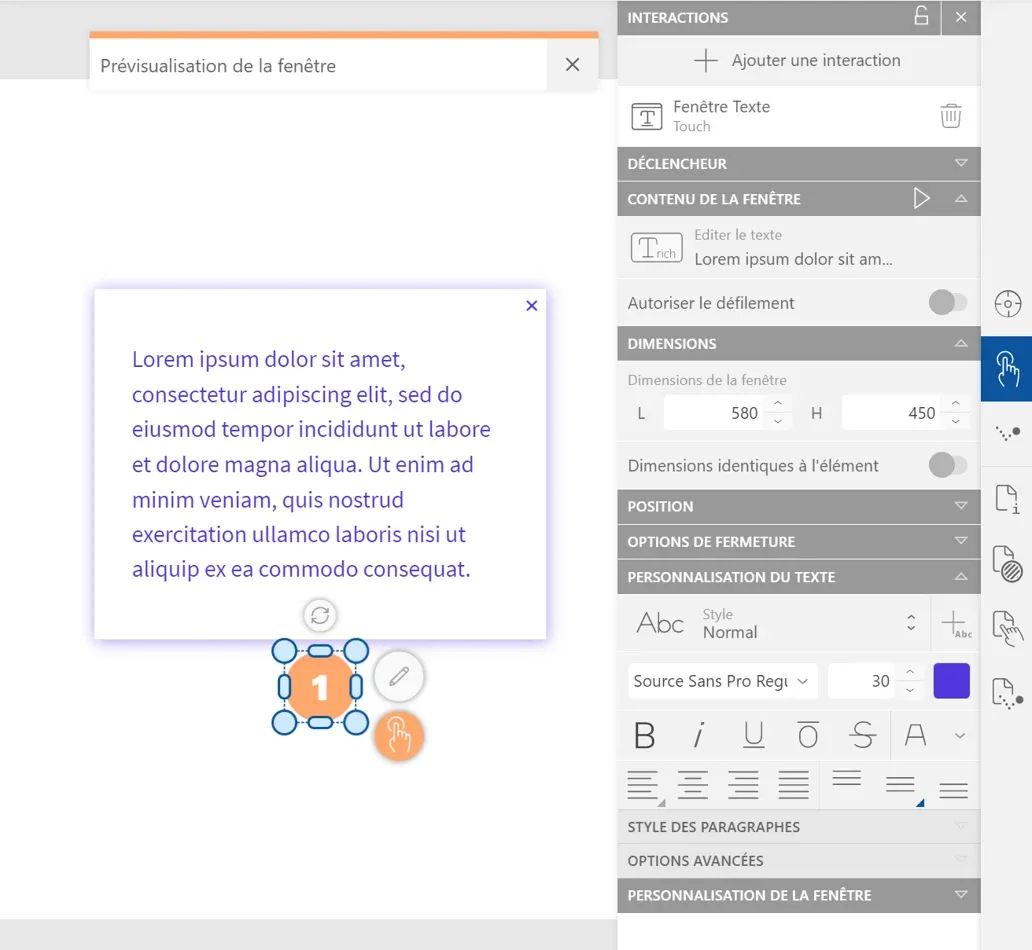
Step 3: Apply a Window to the Button
Select the button then click on the "Element interactions" tab (touch icon) in the right sidebar. Choose the "Text window" option and customize the different parameters:
- Define window activation in the "Trigger" tab: the Touch option is selected by default, unfold the menu to choose another trigger action
- Insert your text in the "Window content" tab
- Modify the size and position of the window in the "Dimensions" and "Position" tabs: these parameters can be fully customized or linked to those of the trigger button
- Detail the closing conditions of the window in the "Closing options" tab
- Customize the style of the text and window in the "Text customization" and "Window customization" tabs: find the same customization tools as for page elements
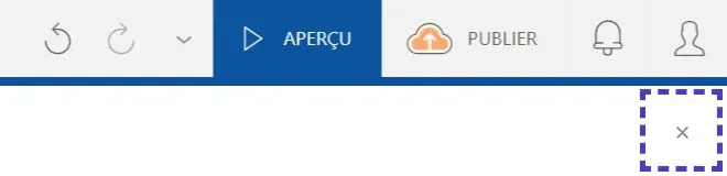
Step 4: Preview
To preview the project, click on the "Preview" button at the top left of the work area. This mode will allow you to visualize and test the interactions you just created.

To exit the mode, click on the "Close" button at the top right of the window.
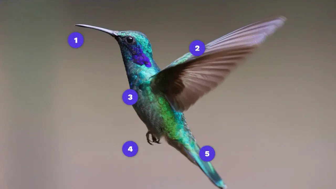
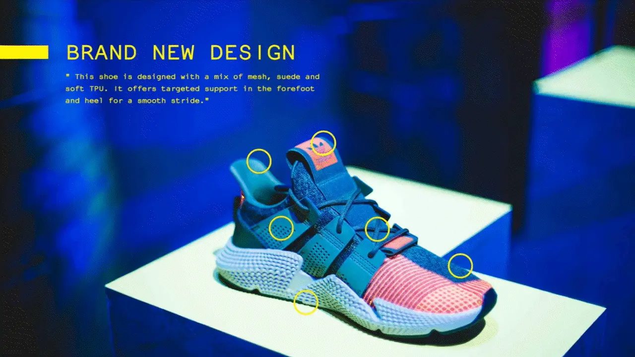
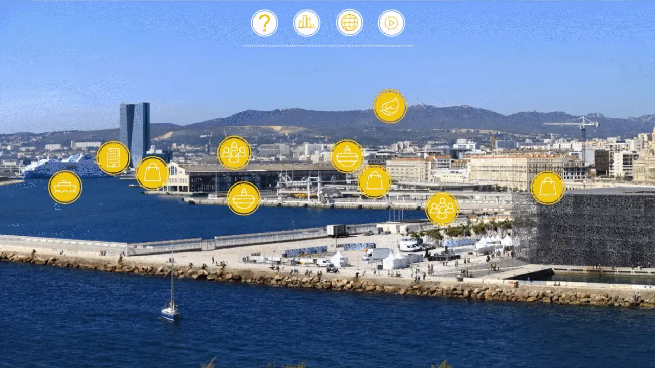
Examples of interactive images: