Tutorial: Scrollable area
Elements compatible with scrolling
This functionality can be applied to several types of elements. It is activated in the Element Customization tab (target icon) to the right of the workspace:
- Text: check the Allow scrolling option in the Scrolling Options window
- Menu: check the Allow scrolling option in the Display Options window
- Custom component: choose the Scrolling option in the Display mode menu of the Component window
- Text & custom windows: check the Allow scrolling option in the Scrolling Options window
Creating a scrolling custom component
Step 1: Create the content
Add to your page the elements that will appear in the area.
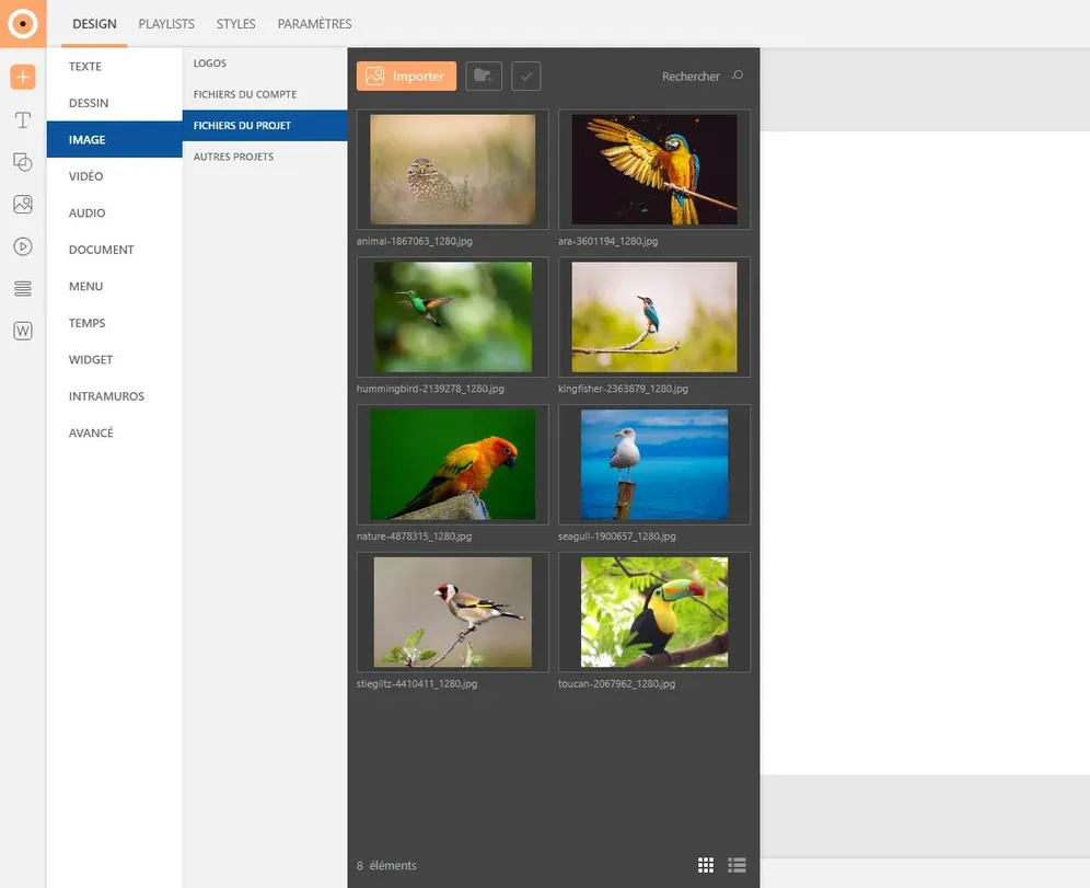
To choose an image, expand the "Gallery" tab (image icon) in the left sidebar then select your desired image. To insert it, click the "+" button or drag it directly into the page.
To add other types of media (videos, pdfs...) expand the corresponding tab in the left sidebar. Insert your media the same way as an image. Don't forget to import your media into the gallery beforehand.
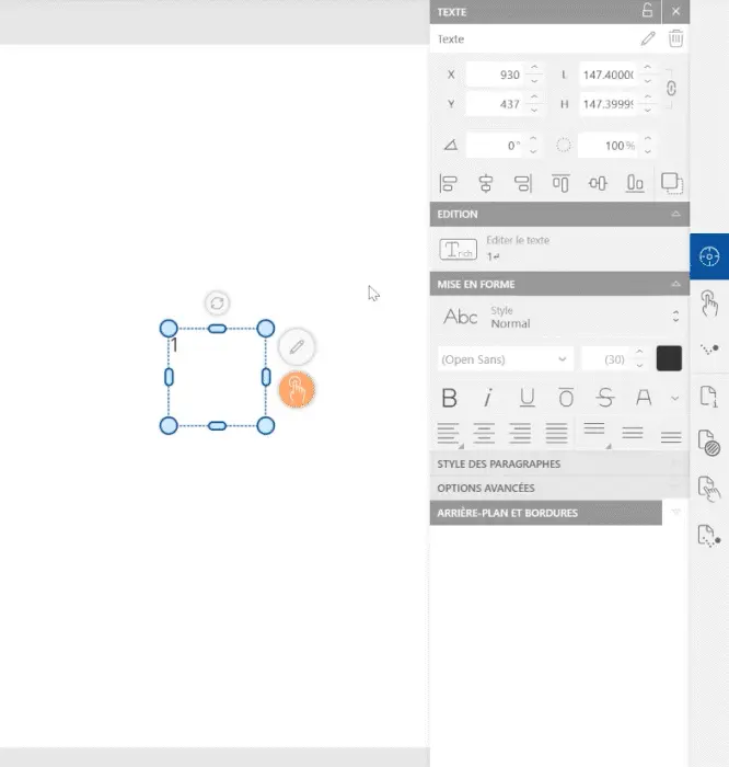
Customize the size and position of your image in the "Options" window (crosshair icon), to the right of the workspace.
To add text, click the "Text" button in the insertion menu. Choose the style you want to apply or draw the block directly on the page.
Customize the element in the "Element Customization" tabs (crosshair icon) to the right of the workspace. Modify the text and block style as you wish: change typography, size, text color, add a colored background to the block...
Step 2: Transform into component
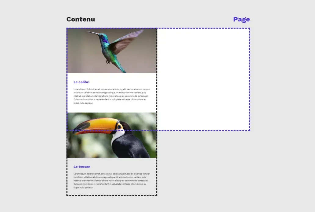
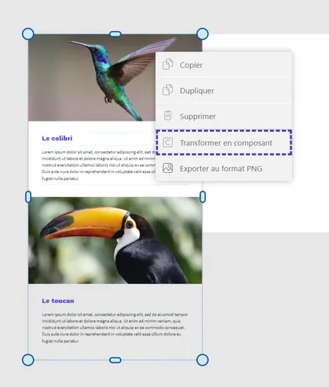
First, make sure that all elements of your future area are gathered on your page, arranged in the desired location. Some elements must overflow, so that the scrolling area is visible in its entirety; leave in the page the elements that will appear as priority.
Select all your elements then right-click: choose the "Transform into component" option in the window.
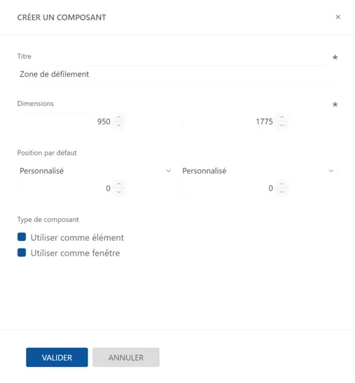
Name your component and modify its parameters in the configuration window. Dimensions and position are entered automatically, you don't need to modify them. Once configuration is complete, click the "Validate" button.
Step 3: Configure the component
The component is automatically inserted in the page, at the location where it was created. Adjust its size to fit the page dimensions: surplus elements must now be invisible, hidden in the component block.
To allow scrolling, select the component then access the windows in the "Element Customization" tab (crosshair icon) in the right sidebar: in the "Component" window, select the Scrolling display mode.
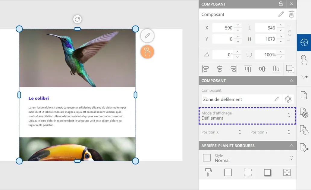
You can also access the component management space: in the bottom menu of the "Pages" window, to the left of the workspace, click the "Component" button (C icon). Select your component to modify it.
To return to the project pages, click the "Project pages" button (page icon) in the same menu.
Step 4: Preview
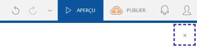
To preview the project, click the "Preview" button at the top left of the workspace. This mode will allow you to visualize and test the scrolling area you just created.

To exit the mode, click the "Close" button at the top right of the window.
Automatic scrolling options
While classic scrolling is triggered by interaction, automatic scrolling plays independently. To activate this option, click the "Element Customization" tab (target icon) in the right menu then expand the "Scrolling Options" window.

- Choose the scrolling speed
- Set the scrolling activation delay
- Modify the scrolling type: return to beginning, reverse scrolling, continuous scrolling, entrance and exit
- Visualize the scrolling you just configured

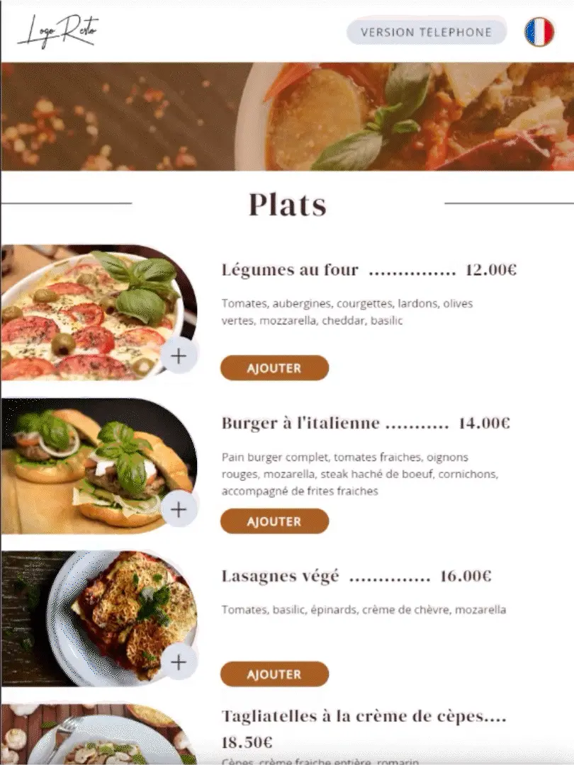
Scrolling examples: